June is almost over, and there hasn't been a single developer blog post! Oh no! We've been rather busy around here lately, and since this blog is updated by the developers themselves, it can really only be updated when one of us gets a minute. We appreciate everyone's support and patience as we continue through this development cycle.
(On a side note, since I'm writing this blog entry from a PC, I will be showing screen shots from the PC version of our product. Since we are developing the PC and Mac version simultaneously, what you see on one platform, is identical to what you will see on the other. Everything except for the shape of various buttons and other system specific UI elements anyway. I promise that you're not missing anything.)
So what has changed since the last update? Where should we begin...
In our last update, the only editor that we had working 100% was the material editor. We now have an options editor, and a texture editor in place, and fully functional. This is a big step forward, and a very important step in regards to testing our product, and calibrating various defaults and parameters. These editors still need a little polish, at the moment there are some controls that need to be grouped together in a more logical manner, and some of the labels for controls need to be renamed, but the functionality is there, and that's the main goal we were aiming for.
Options Editor
Texture Editor
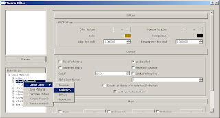
There has been some work done to our material editor as well. For this release, we have been trying to mimic our existing product's UI as much as we can. This is being done mainly because our existing users know how to use this interface. Redesigning UI is no small task, and it needs to have a lot of preproduction done before we can start to venture off in that direction. There have been some small changes though, and we hope that they will be received with open arms by our users (especially since the changes were requested by users in the first place).
In the images from our last update, you may have noticed that the layers that were being created had some crazy looking names. Instead of Diffuse, it was a BRDFDiffuse layer. Our default material even looked a bit strange. That's because we were deriving names directly from the V-Ray plugins themselves. Also, the names reflected the internal representation of the material. So the diffuse layer in our default material was named “/DefaultMaterial/BRDFDiffuse”, and there was no way to rename the material without breaking the internal representation of the material. Now we have the standard 4 layers that everyone knows and loves, Emissive, Reflection, Diffuse, Refraction. Each layer can be renamed, as can the base material that contains all of these layers. This brought us to the same level of functionality that our old product had.

We have had a number of you (our users) contact us in the past, saying that the existing functionality of our “VRayMtl” was a bit limiting, and could use a little love. Among your suggestions, was the removal of the layer groups. In our old product, you would have to expand our Scene Materials menu, and then the layered material's menu, and then the individual layer groups before you could view the individual layers in a given layered material. That extra grouping of layers is really kind of useless, and beyond that, it constrains the drag and drop functionality to just being able to drag and drop within a particular layer group. So we have taken out the layer groups. We have also added drag and drop functionality in to our product, and yes, you are allowed to drag and drop a layer anywhere inside of a layered material! So if you've been dying to see what it would look like if you put an emissive layer under a refraction layer... go for it! Of course if you don't feel quite so adventurous, and don't want to go mucking around with the natural order of things, you can just create layers as you normally would, and a nice little algorithm will make sure that the layers are placed in the correct order for you. If you do happen to play around with the layer order, and then add a layer, it will try it's best to place the new layer in the right spot, but you'll probably have to help it out a little bit to make sure it's where you want it to be.
After Dragging and Dropping Layers =>
We have linked the SketchUp materials up to our V-Ray materials as we did in our old product. For each of our materials, there is a corresponding SketchUp material, and vice versa. We received a lot of positive feedback about having our materials set up this way, so we decided to keep it this way.
Now that we have a working texture editor, we have the ability to add bitmap textures to a material. So far this only works while setting the texture from our material editor. If you add the bitmap from SketchUp's material editor, it doesn't reflect the changes in our material editor, or in the resulting render. This will be added soon though.
The infinite plane was added at last, so now we can test renders with ground planes. This can be quite useful when you're trying to determine if the translation of a piece of geometry is being set correctly, or if the shadows are being casted properly, etc. We're happy to see it's bright and shining face back in our renders again.
We can now save and load new scenes! This was not in place before, so it made things a bit difficult to test in some cases. When you are working with a development build of a product, loading and saving scenes isn't always that useful though, especially when major changes are being made to the way things are represented in the product. We now have things at a somewhat defined state, so loading and saving should be able to come in handy in some cases.
For all of those Windows users out there that have suffered headaches during our install process because you do not have administrative privileges, help has arrived at last! Set down that phone, don't call your IT guys just yet, because we have eliminated the need to install our product with administrative privileges! Standard users around the world, feel free to smile excessively.


.jpg)


